

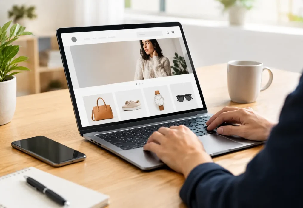

A homepage has only a few seconds to answer the questions every potential customer brings with them: What do you do? Is this for me? Can I trust you? What should I do next? The best website homepage elements make those answers immediate, credible, and commercially focused.
For a small or midsize business, the homepage is not simply an online brochure. It is the front desk, sales presentation, proof of capability, and next-step prompt working around the clock. A beautiful page that leaves people confused will not build momentum. A clear, strategically designed homepage can turn paid traffic, social media attention, referrals, and search visibility into real inquiries and sales.
What the Best Website Homepage Elements Need to Do
The right homepage is built around customer decisions, not a checklist of trendy design features. Visitors should understand your value quickly, see evidence that your business delivers, and find a low-friction path toward contacting, booking, buying, or requesting a quote.
The exact layout depends on your business model. An e-commerce brand may lead with a product category and limited-time offer, while a B2B company may lead with expertise and a consultation. A local service provider may prioritize location, availability, and reviews. Still, the core building blocks remain consistent.
1. A clear headline that states your value
Your main headline should say what you provide and why it matters to the customer. Avoid broad claims such as “We Deliver Excellence” or “Innovative Solutions.” They sound polished but give visitors no reason to stay.
A stronger headline connects your service or product to an outcome. For example, a commercial cleaning company could say, “Reliable office cleaning for healthier, client-ready workplaces.” It is specific, customer-focused, and easy to understand at a glance.
2. A supporting message that adds context
The headline earns attention. The supporting copy gives people enough detail to decide whether your offer fits their needs. Use one or two short sentences to explain who you serve, what makes the offer relevant, and what result customers can expect.
This is also a smart place to mention a service area, industry specialty, delivery model, or differentiator. Keep it readable. Your visitors should not need to decode marketing language before they can take action.
3. A primary call to action people can spot instantly
Every homepage needs a clear next step above the fold. “Request a Quote,” “Book a Consultation,” “Shop Best Sellers,” or “See Our Work” are all stronger than a generic “Learn More” because they set a clear expectation.
Choose one primary action instead of giving equal visual weight to five different buttons. If your sales cycle is longer, booking a call may be the right move. If you sell directly online, taking visitors to a collection or featured product may be more effective.
4. A visual that supports the message
The hero image, video, or graphic should help customers understand what they are buying. Original photography of your team, your work, your products, or your customers often builds more confidence than generic stock imagery.
For some businesses, a short motion graphic can demonstrate a process quickly. For others, a product image with a strong offer will perform better. The trade-off is load speed: visual impact matters, but oversized media that slows the page can cost you leads before the page even appears.
5. Trust signals near the top of the page
Customers are cautious online, especially when they are considering a high-value purchase or a new provider. Give them reasons to trust your business early. This may include recognizable client logos, review ratings, industry certifications, years in business, media mentions, or a concise statement about your experience.
Trust signals work best when they are real and specific. “Trusted by hundreds of local businesses” is more meaningful when paired with customer names, credible testimonials, or verified ratings.
6. A simple overview of your services or products
Do not make visitors hunt through the menu to understand your core offer. A homepage section that introduces your main service categories or product lines helps people self-select quickly.
Keep each description focused on a benefit, not just a label. Rather than writing “Web Design,” explain that you create professional websites designed to build credibility and generate inquiries. Each item should lead naturally to a deeper service or product page for visitors who need more information.
7. Benefits that answer “Why choose you?”
Features describe what you do. Benefits explain why the customer should care. This distinction matters because most visitors are not looking for a list of your internal capabilities. They are looking for a solution to a business problem or personal need.
Focus on the outcomes your customers value: faster turnaround, greater visibility, reduced stress, dependable support, better quality, or increased sales. Strong benefit statements help your brand compete on more than price.
8. Social proof with real customer language
A well-placed testimonial can overcome hesitation because it lets a customer hear from someone who has already made the decision. The best testimonials mention a recognizable problem, describe the experience, and point to a meaningful result.
Short quotes are useful, but avoid filling the homepage with vague praise. “Great service” is positive, yet it does not tell a prospect much. A testimonial that explains how you improved a customer’s website leads, store traffic, or project timeline carries more weight.
9. Proof of your work and results
Show, do not merely claim. Case studies, before-and-after visuals, portfolio highlights, project snapshots, and measurable outcomes can all demonstrate the quality of your work.
This is particularly valuable for agencies, creative firms, contractors, and B2B companies where customers want evidence before starting a conversation. Even if confidentiality limits what you can publish, you can explain the challenge, your approach, and the type of result achieved.
10. An “about” section with a human point of view
Customers buy from businesses they believe in. A brief homepage introduction can communicate your experience, values, and approach without forcing every visitor to navigate to a separate About page.
Keep this section customer-centered. Your company history matters when it explains why clients receive better service, deeper expertise, or more reliable outcomes. A founder photo or team image can also make a service business feel more approachable.
11. Contact details that remove friction
If someone is ready to reach you, do not make the process difficult. Include a visible phone number, email address, form, business location when relevant, and realistic response expectations.
For local businesses, location details and service areas are especially useful. For appointment-based companies, an online booking option can reduce the back-and-forth that causes interested prospects to disappear. The goal is simple: make the next step feel easy.
12. A final call to action for ready buyers
Not every visitor will act after reading the hero section. Many will need to see your services, proof, and customer feedback first. End the homepage with a direct invitation that reflects where they are in the decision process.
A strong final call to action might invite visitors to request a proposal, schedule a discovery call, start a project, browse products, or speak with a specialist. Repeat the primary action, but give it fresh context based on the value the visitor has just seen.
Common Homepage Mistakes That Cost Businesses Leads
A homepage can have all the right sections and still underperform if the message is unfocused. Too much copy, competing calls to action, slow-loading visuals, and unclear navigation create unnecessary friction. So does trying to appeal to everyone at once.
Another common mistake is leading with the company instead of the customer. Your business story has value, but visitors first need to understand how you can help them. Put the customer problem and outcome first, then use your expertise, team, and proof to show why you are the right choice.
Mobile experience also deserves attention. Many people will meet your brand for the first time from a phone after seeing a social post, search result, or recommendation. Buttons need to be easy to tap, forms need to be short, and key messages need to remain clear without a desktop-sized screen.
Build a Homepage That Supports Real Growth
The best website homepage elements work together as a guided customer journey. They make your offer clear, establish trust, show proof, and move people toward an action that supports your business goals.
At RDM Media, we help businesses turn scattered online attention into a professional digital presence built to perform. Start by looking at your own homepage as a first-time customer would: if the value is not clear in seconds, the next opportunity to improve it is already in front of you.